As part of Aflac’s lead generation program at SQ1, we perform ongoing testing to further optimize their lead funnel.
This includes but is not limited to: A/B testing, performing usability studies, creating prototypes for future states, optimizing landing pages for the paid search team, and more.
My roles
Design research
UI/UX Design
A/B testing
User Testing
Design research
UI/UX Design
A/B testing
User Testing
Deliverables
VWO Tests
Testing Summaries Usability Studies Custom Reporting Sheets Presentations Mockups + Prototypes Journey Mapping
VWO Tests
Testing Summaries Usability Studies Custom Reporting Sheets Presentations Mockups + Prototypes Journey Mapping
Responsibilities
• Create and review heatmaps, session recordings, usability tests, and analytics properties and present objectives for ongoing testing ideas and recommendations.
• Set up reporting framework for each test; establish key metrics for evaluation and reporting while analyzing them on a regular basis.
• Build landing pages using conversion design/landing page optimization principles
• Give tons of supportive content to help win the internal teams over for tests and recommended implementations.
EXAMPLES OF WORK
New Product User Testing
In the midst of a new product launch, Aflac wanted to get user feedback on an application process.
I set up a user study that included users that matched their site demographics, and with the help of coworkers, created a fully functional prototype of the experience. Tasks were created through each major step in the application process. Participants would go through each task, speaking aloud about the experience as they worked through the study.
The study found several key pain points. A vast majority of users found the application process too long, they couldn’t understand quite a bit of insurance lingo/jargon, and the final steps were unclear (”would the client reach back out to me??” was a common question).
To adjust the new product, our team went back through the application process to take out unnecessary steps, define and clarify insurance jargon where needed, and define what would happen after the user completed the application to help increase conversion and ease user confusion.
The product was launched with some, but not all of our recommendations. A low amount of traffic was sent to the new experience, and the client determined that this would only be the Phase 1 version of their new product.
The new iteration of the product will be launching in 2020, backed by some of the research that we did for the first iteration.
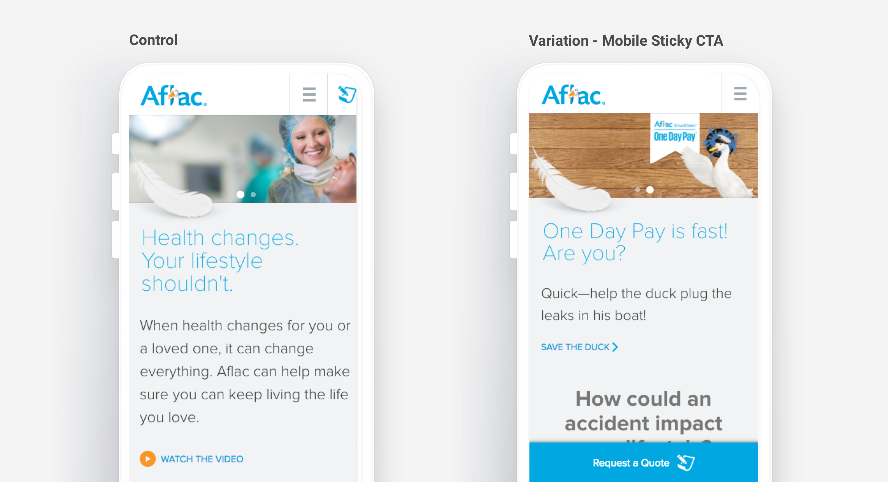
A/B Test - Mobile Nav CTA
Aflac had no other mobile CTA except a paper icon on the top right corner next to the navigation menu. We tested a variation with a mobile sticky CTA that stayed with the user no matter where they were on the site, with a clear CTA of “Request a Quote”.
Mobile conversions increased by 89%, and the test reached significance in a few days.
I’m happy to chat about other A/B tests that we have done over a phone call.
Lead Form - Future State Concepting
Ultimately, with any testing program, comes the inevitable question of “What can we do next?” Optimization can be continual, and in some aspects tiring to ideate.
However, the joy of the UX field is that there is always opportunity to dream up future states.
After years of optimization and user testing for Aflac, I noticed a few common issues:
-
In some aspects our testing was becoming less impactful. It seemed as those users were still not quite to the point of submitting a lead and in fact less likely than the year prior.
-
A common bit of feedback from user testing was that users wanted to see what they might be paying month to month for an Aflac plan, something that isn’t necessary available on the site.
The problem was, by only having this information available by going through the lead form process (which involved being called by an agent) - Aflac was risking alienating potential customers who might prefer a different mode of contact. Market and testing data backed this claim up:
-
32% of the general population finds the phone the most frustrating way to engage customer service.1
-
50% of millenials prefer text/SMS as their primary mode of contact.1
- 38% of usability test users noted that they preferred live chat as their form of contact.
1. Conversocial Report: The State of Social Customer Service
Not only would the client see potential lift in conversions from these customers, but also could differentiate themselves from their direct competitors. All other competitors in their direct vertical had similar lead form processes of phone calls from agents.
Users ultimately want to compare different types/brands of insurance quickly - why have an additional barrier of communication?
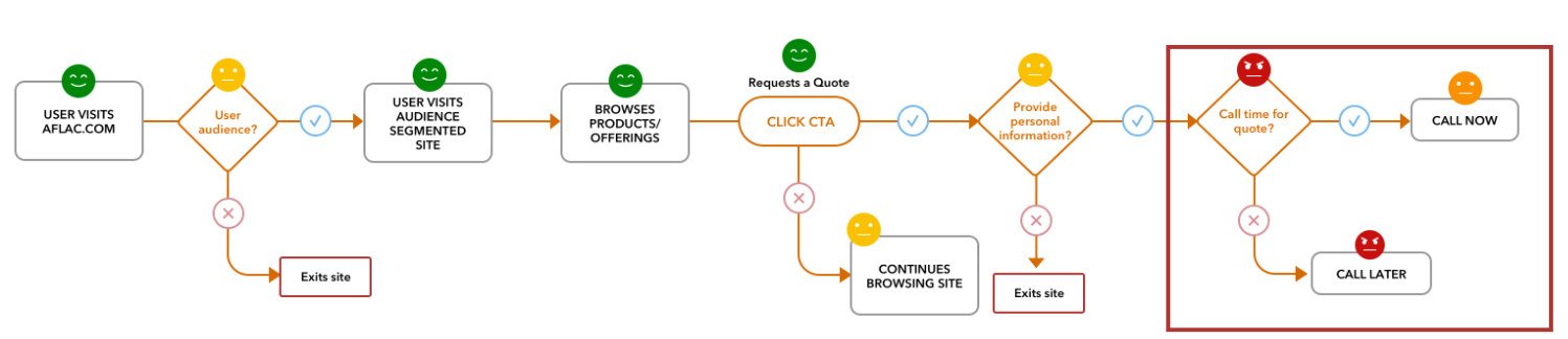 Lead form journey mapping
We recommended a few items in our pitch:
-
Deeper dive into the full lead process, to fully map out inconsistencies and bottlenecks. This would include mapping out the entire call center process with their scripts. Using this information, we would improve the current end-to-end lead process, not just onsite as we had been doing.
-
Perform user studies based on conversational or different types of lead forms out there to better benchmark what users might expect from different forms of contact.
-
Implement other forms on contact on site, based on learnings from user testing, and testing iterations of these (i.e. chatbots, smart contact forms, etc) to further improve lead quality and quantity, along with user satisfaction.
-
Add content on site that might help users find the information that they are looking for - like coverage cost calculators.
It boiled down to this - users expect more than having to make a phone call when looking for information. If information or easy contact is not onsite, they might bounce and find an easier option.