GoHealth, an urgent care center with hundreds of locations across the states, primarily focused on using Sq1 as a recommendations and testing partner. Our partnership included monthly reporting, A/B testing queues, heatmapping, and landing page design.
In Spring 2018, I noticed in my monthly reporting that mobile conversion rates were showing a unusual lag in overall location page visits and visit requests.
In the NY area specifically, which had the highest density of center locations, the question that was posed was - how do we visually handle so many locations and help with the center discovery flow?
In the NY area specifically, which had the highest density of center locations, the question that was posed was - how do we visually handle so many locations and help with the center discovery flow?
My roles
Design research
Custom event tags
Recommendations
Design research
Custom event tags
Recommendations
Deliverables
Wireframes
Filtering rules User journey mapping
Wireframes
Filtering rules User journey mapping
Responsibilities
Found the root causation of low mobile conversion rates and filter usage. Based on best practices for map UX, gathered and noted ideas that would work best for GoHealth Pitched UI with location clustering, improved filters, cohesive UI, and better map interaction.
Found the root causation of low mobile conversion rates and filter usage. Based on best practices for map UX, gathered and noted ideas that would work best for GoHealth Pitched UI with location clustering, improved filters, cohesive UI, and better map interaction.
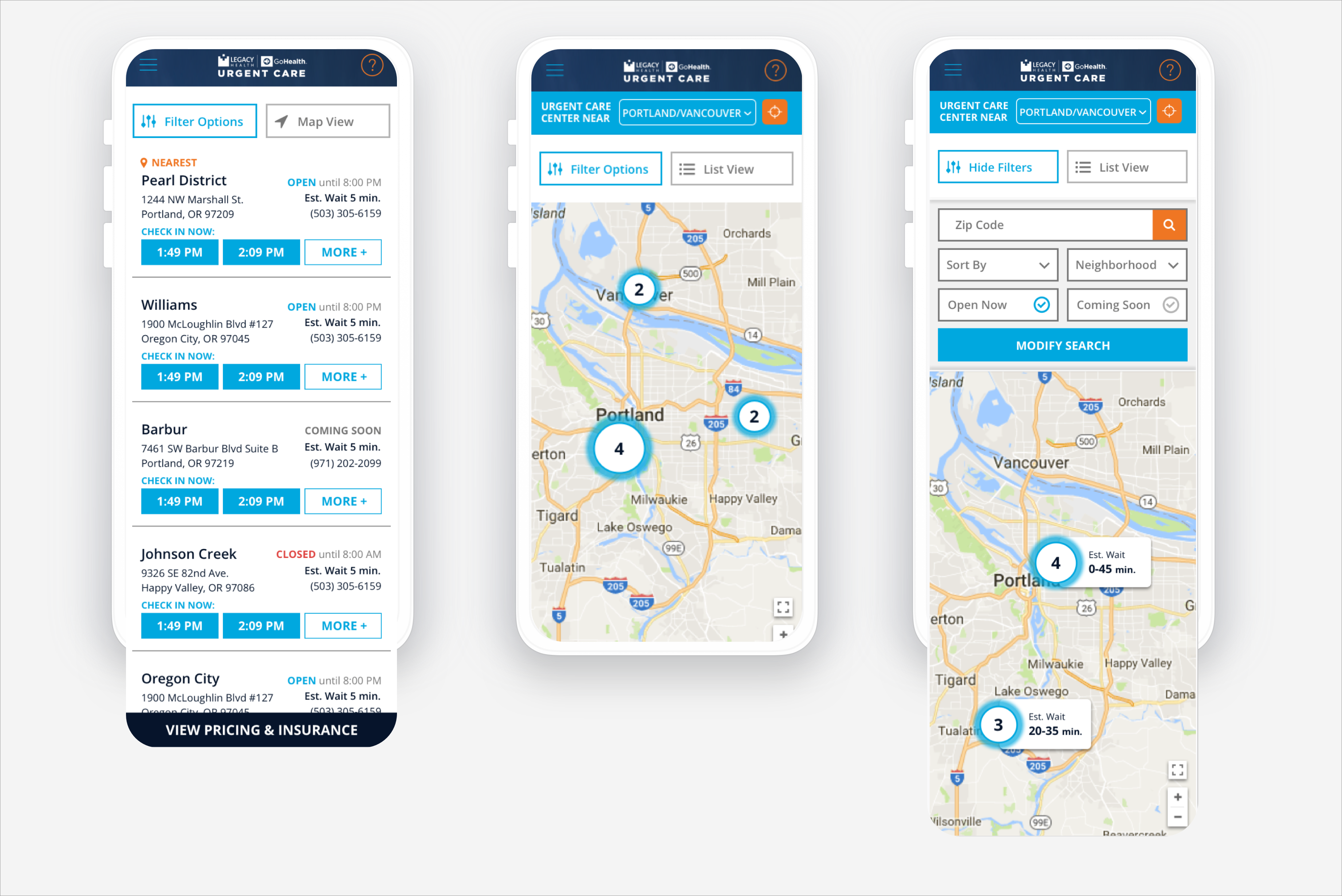
Proposed Mockups - Spring 2018
Mapping Usability
After pulling heatmaps from Hotjar for the location search pages, I noticed that most of the clicks were happening on the map on mobile, as if the users were moving the map around to find locations vs just using the filters present. Filters had little to no clicks on them. Markets with a large number of locations on the map (like NYC) show pins that are too tiny to interact with, and session recordings showed users had difficulty interacting with the individual locations on the map.
I had found an event tracking tag that would help filter user session recordings with “rage clicks” or multiple clicks/taps happening in short succession. After some customization for GoHealth, I inputted the filter into Hotjar to see how users were clicking on the map, especially if they tapped multiple times in a short span.
With this new session tag filter in place, I quickly realized an additional reason that mobile users were tapping on the map so much. Two fingers were needed to pan the map, which is not a natural interaction when most users are used to only needing one finger to move a map around.
Assisting Location Discoverability
As we looked through the market page user experience in more detail, it became clear to us that there are multiple usability issues with these pages, and addressing them individually wouldn’t really solve the core problems visitors were experiencing.
We recommended testing an overhaul of the location search pages’ UI, with location clustering, better filters, improved interactions, and content hierarchy.
Unfortunately, the client pushed off this overhaul and it was never implemented.