As part of an entire UX audit, I was tasked with auditing MoPop’s ticket purchase funnel.
The end result of the audit was a simplified ticket purchase flow prototype that erased redundant screens and confusing secondary flows.
My roles
Design research
Prototypes
Design research
Prototypes
Deliverables
Wireframes
Mockups
User journey mapping
Wireframes
Mockups
User journey mapping
Responsibilities
Audited ticket purchase funnel through heuristic analysis, heatmapping, and analytics. Created prototypes using MoPop’s global styles to provide an idea for a more consistent and easy to understand booking funnel, with the intention of dispelling confusion and decreasing drop off rates.
Audited ticket purchase funnel through heuristic analysis, heatmapping, and analytics. Created prototypes using MoPop’s global styles to provide an idea for a more consistent and easy to understand booking funnel, with the intention of dispelling confusion and decreasing drop off rates.
UX Audit Findings:
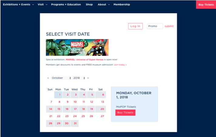
The initial ticket page features an ad like visual for the upcoming event highest on the page. The order of content doesn't align with the order of importance in relation to purchasing a ticket. The varied alignment also makes it hard for users to quickly read the information.
The month calendar alternated colors for the different week rows. At first glance, it appears that the gray colored days could represent days that are sold out and the active selected date lacks contrast.
The current ticketing page could have been confusing users who aren't sure which event or exhibits will be up on the days they are interested in visiting. Additionally, the ad at the top seemed to imply that this is the event you are purchasing tickets for.
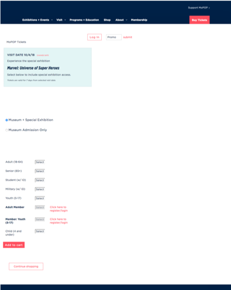
The ticket funnel navigation remained the same as the sticky nav when a user is in the booking funnel. This made it so that two prominent "Buy Tickets" buttons are visible which could add cognitive load. If the user clicked the Buy Tickets in the nav, they were sent all the way back to the main site’s ticket page, essentially starting the whole process over, and based on heatmap and analytics data, this was certainly happening.
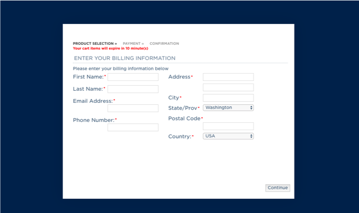
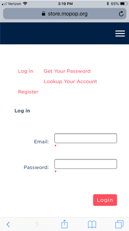
The current form fields weren’t aligned in a way that makes them easy to read. The input label is put to the left when shorter. On labels that are longer it appears above and to the left. There is an opportunity to follow form best practices.
![Time selection screen.]()
![Form fields on ticket purchase info screen.]()
![Ticket options all present below the fold.]()
![Mis-aligned form labels and links present on the mobile login screen.]()
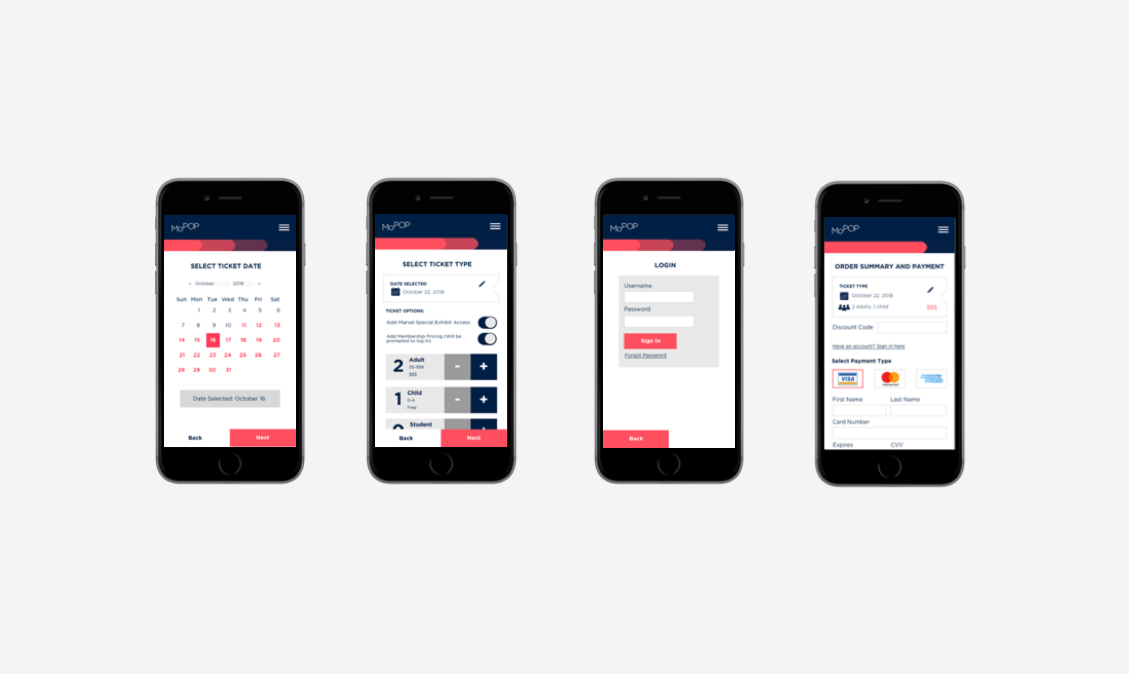
Step by Step - Simplified Step Progression
I mocked up redesigns of ticket funnel pages, with global elements and styles to improve consistency. Similar CTAs, input alignment, progress indicator were the main focuses, as well as designing with the mobile user in mind since more than 60% of MoPop’s traffic was mobile users. Step progress is indicated and CTA so users are aware of where they are in the funnel. There is also a consistent way for users to toggle between the steps with a "Next" and "Back" CTA. I also improved the login screen to be fully aligned and not take the user entirely out of the booking funnel.
![]()
The initial ticket page features an ad like visual for the upcoming event highest on the page. The order of content doesn't align with the order of importance in relation to purchasing a ticket. The varied alignment also makes it hard for users to quickly read the information.
The month calendar alternated colors for the different week rows. At first glance, it appears that the gray colored days could represent days that are sold out and the active selected date lacks contrast.
The current ticketing page could have been confusing users who aren't sure which event or exhibits will be up on the days they are interested in visiting. Additionally, the ad at the top seemed to imply that this is the event you are purchasing tickets for.
The ticket funnel navigation remained the same as the sticky nav when a user is in the booking funnel. This made it so that two prominent "Buy Tickets" buttons are visible which could add cognitive load. If the user clicked the Buy Tickets in the nav, they were sent all the way back to the main site’s ticket page, essentially starting the whole process over, and based on heatmap and analytics data, this was certainly happening.
The current form fields weren’t aligned in a way that makes them easy to read. The input label is put to the left when shorter. On labels that are longer it appears above and to the left. There is an opportunity to follow form best practices.
Step by Step - Simplified Step Progression
I mocked up redesigns of ticket funnel pages, with global elements and styles to improve consistency. Similar CTAs, input alignment, progress indicator were the main focuses, as well as designing with the mobile user in mind since more than 60% of MoPop’s traffic was mobile users. Step progress is indicated and CTA so users are aware of where they are in the funnel. There is also a consistent way for users to toggle between the steps with a "Next" and "Back" CTA. I also improved the login screen to be fully aligned and not take the user entirely out of the booking funnel.